How iPhone Duo Resolution Changes Responsive Mobile App and Website Design
Apple’s first foldable iPhone introduces two very different display environments. Here is what its resolution, screen size, pixel density, fold, and changing viewport mean for mobile apps and responsive websites.
Sections
Responsive design used to be discussed mainly as a question of supporting different phone sizes. Apple’s iPhone Duo makes that definition much less useful. A single device can now move between a relatively compact outer phone display and a much larger folding inner display, while applications may also appear in different poses, safe areas, aspect ratios, and multitasking configurations.
This creates an important question for product teams: does the iPhone Duo’s unusual resolution mean mobile applications and websites need an entirely new approach to responsiveness? The answer is more nuanced. Physical resolution matters, particularly for images, rendering quality, and graphics performance, but it is not the number developers should use to determine the structure of an interface. The more important factors are the logical viewport, available window size, size class, safe areas, fold position, and how gracefully the interface can reorganize itself when those values change.
What is different about the iPhone Duo display?
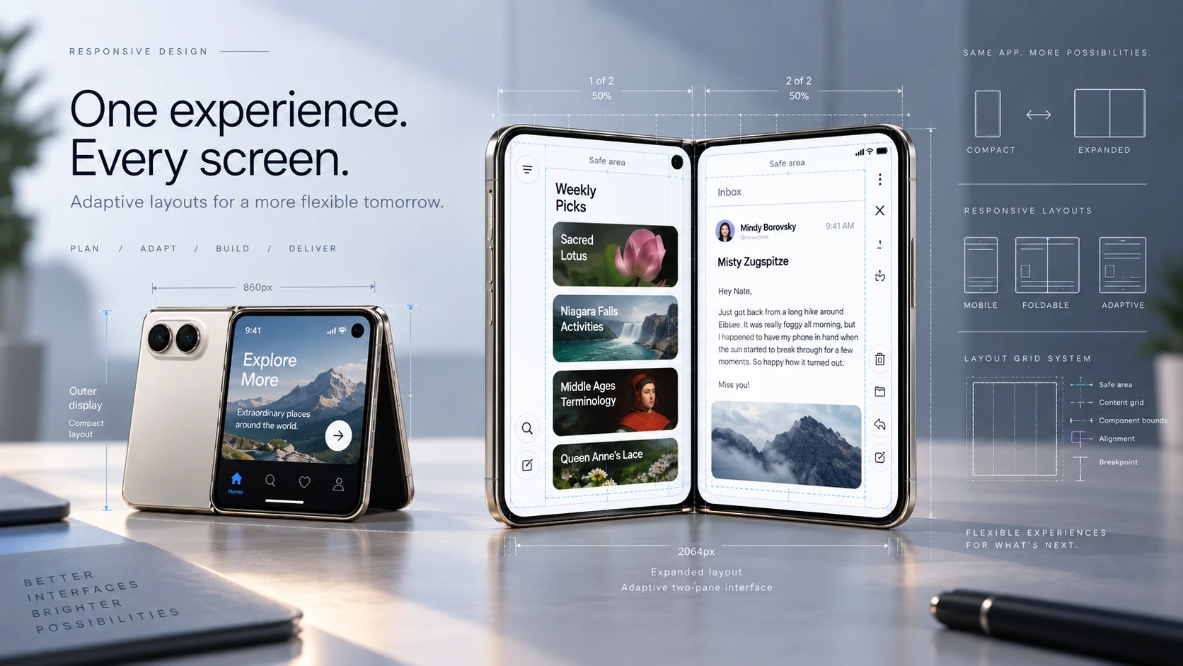
Apple’s iPhone Duo has two significantly different viewing environments. Its outer Super Retina XDR display measures 5.4 inches and has a resolution of 1398 × 2034 pixels, while opening the device reveals a 7.6-inch folding inner display with a resolution of 1878 × 2670 pixels. Both displays also support adaptive refresh rates of up to 120Hz.
Those specifications are important, but they do not mean an application should create one layout at 1398 pixels wide and another at 1878 pixels wide. Modern mobile interfaces are intentionally separated from raw physical pixel dimensions. On iOS, interface geometry is generally expressed using logical points and an associated display scale. On the web, browsers use CSS pixels and a device pixel ratio that maps those CSS pixels to the physical pixels available on the display.
This distinction is fundamental. The Duo’s physical resolution determines how much detail its displays can render, but the available logical space determines how your navigation, cards, forms, buttons, sidebars, images, and other interface elements should be arranged.
Resolution and responsiveness are not the same thing
The word “responsive” is sometimes used to describe two different qualities of software. The first is layout responsiveness: whether an interface adapts correctly when the available screen or window size changes. The second is performance responsiveness: whether interactions, scrolling, animations, and transitions continue to feel immediate.
The iPhone Duo can affect both, but for different reasons. Its change in available display space creates a layout challenge, while its high-resolution displays can increase the rendering workload of graphics-heavy experiences. A normal form, content feed, or settings screen is unlikely to become slow simply because the display contains more physical pixels. A screen filled with full-resolution imagery, complex blur effects, a large canvas, multiple videos, maps, or GPU-heavy animations can be more sensitive to the amount of content being rendered.
For product teams, this means “supporting the iPhone Duo resolution” should not become a task where developers simply add another resolution to a list. The real task is making the product genuinely adaptive.
The biggest impact on mobile applications is changing available space
Apple’s developer guidance for the iPhone Duo emphasizes flexible layouts rather than creating a completely separate interface for every possible device pose. Apple recommends thinking in terms of compact and regular size classes and designing across a continuum of available sizes.
The outer display behaves much more like a conventional iPhone environment. When the Duo is opened, however, its inner display offers regular horizontal and vertical space, making interface patterns such as sidebars, split views, and two-column layouts much more useful.
Consider an e-commerce application. On the outer display, a product catalogue may show a single-column feed with filters behind a button or sheet. Open the device and the same application could place filters in a persistent sidebar while showing more products beside them. A messaging application could move from a conversation list to a list-and-detail layout. A business dashboard could expose navigation, summary information, and detailed content at the same time instead of forcing users to move between separate screens.
The application is still the same product. The hierarchy and functionality remain consistent. What changes is how efficiently that product uses the available space.
Hard-coded screen dimensions become especially risky
Applications that assume one fixed screen width are particularly vulnerable on a foldable device. A layout might look correct on a standard iPhone because the development team tested only a familiar collection of handset dimensions. On the Duo, that assumption can be exposed as soon as the application moves to the larger inner display or appears in a resized environment.
Problems may include excessive empty space, content stretched into unreadably long lines, navigation remaining unnecessarily collapsed, cards becoming too wide, dialogs appearing in awkward positions, buttons moving too far from the user’s natural reach, or elements overlapping system controls.
Apple’s current guidance also advises developers not to depend on a single “main screen” assumption on a device capable of more complex display behavior. Layout decisions should come from the environment of the current scene or window and from the actual space available to the interface.
For teams building or modernizing iPhone products, this makes adaptive architecture increasingly important. Our iOS app development work approaches interface behavior as part of the product architecture rather than treating each new device dimension as an isolated design patch.
Safe areas become more important on a folding iPhone
The Duo creates another issue that raw resolution numbers cannot describe: not every visible pixel should necessarily contain an important interactive element. Cameras, system controls, display edges, rounded corners, fold-related regions, and different device poses can all influence where content is comfortable or safe to place.
Apple recommends keeping important foreground controls within safe areas and allowing backgrounds or decorative content to extend farther when appropriate. The company also notes that safe-area values can be asymmetric on the iPhone Duo, which is an important warning for developers accustomed to assuming equal left and right spacing.
This particularly affects custom interfaces. A standard navigation component provided by the platform may adapt automatically, while a completely custom toolbar, floating action area, video control layer, or drawing interface may require more careful handling.
A design can therefore technically “fit” the screen resolution and still be poorly responsive. Good responsiveness means that controls remain visible, reachable, readable, and correctly positioned as the physical configuration of the device changes.
The same principle applies to responsive websites
Websites face a similar challenge, although the implementation is different. A website should not identify the user’s device as “iPhone Duo” and then build a special page around its hardware resolution. Responsive web design works better when the interface responds to the browser viewport and to the space available to individual components.
A well-structured responsive website using flexible CSS layouts, Grid, Flexbox, sensible breakpoints, responsive typography, appropriately constrained content widths, and scalable components should already have a strong foundation for the Duo. When the available width increases, the design can naturally move from a narrow mobile composition toward layouts that make better use of a wider screen.
This matters particularly for web applications. A SaaS dashboard, marketplace, project-management tool, CRM, admin portal, or analytics application may gain enough width on the Duo’s inner display to expose secondary navigation or place related information beside the main content. That can create a noticeably better experience than simply stretching the phone interface across the entire display.
Our web development approach follows the same principle: responsive behavior should be designed around available space and real user workflows rather than a growing list of specific phone models.
Physical pixels still matter for images and visual quality
Although layouts should not be built around physical resolution, developers should not ignore pixel density. High-density displays can reveal image assets that are too small or improperly optimized. A low-resolution image expanded across the Duo’s inner display may appear soft, while blindly sending extremely large source images can waste bandwidth, memory, and processing time.
On the web, responsive image techniques such as srcset, sizes, and appropriately compressed image variants allow the browser to choose an image suitable for the rendered size and display density. Native mobile applications have comparable asset-management considerations.
The objective is not to always deliver the largest possible image. It is to deliver enough resolution for the image’s actual rendered dimensions without unnecessarily increasing download size or memory consumption.
Could the Duo’s resolution affect performance?
For ordinary interface layouts, the impact should generally be manageable because both native and web platforms abstract physical pixels behind logical coordinate systems. The application is not manually calculating and drawing every hardware pixel in a standard form or scrolling list.
Performance becomes more relevant when the interface contains elements whose cost increases with the rendering surface. Large image galleries, image editors, games, maps, data visualizations, custom canvases, camera interfaces, video effects, particle systems, complex shadows, blur effects, and full-screen animation can all require more careful profiling on a high-resolution expanded display.
The 120Hz-capable screens also raise the quality bar for animation. Higher refresh rates can make smooth interfaces feel excellent, but dropped frames become more noticeable when heavy rendering prevents an application from keeping up. Teams therefore need to test actual transitions, scrolling, media, and interactive elements rather than assuming that a layout working visually means the entire experience is optimized.
What about fold-aware websites?
Web standards are developing APIs designed specifically for segmented and folding displays. The Viewport Segments API, for example, can expose information about separate viewport regions and offers CSS features for detecting horizontally or vertically arranged segments.
That technology is interesting, but it should currently be treated as progressive enhancement rather than a requirement for a responsive website. Browser support is still limited, so a website should remain fully usable using conventional responsive techniques even when specialized fold APIs are unavailable.
The practical strategy is to build a strong responsive foundation first. If fold-aware browser capabilities are available and provide meaningful additional value, they can then enhance the experience without becoming a dependency for basic functionality.
Do your existing apps and websites need changes?
Not every product needs a major redesign because of the iPhone Duo. In fact, the device may become a useful test of how responsive the product already is. Software built with flexible containers, adaptive navigation, sensible maximum widths, scalable typography, responsive assets, standard platform components, and thorough device testing may adapt surprisingly well.
The products most likely to experience problems are those built around fixed dimensions and assumptions. Common warning signs include interfaces designed against one artboard size, hard-coded widths and heights, navigation that only understands portrait versus landscape, fixed-position controls near screen edges, desktop websites that merely shrink until they fit, or mobile websites that assume every user has approximately the same viewport width.
This is why responsive behavior should be part of engineering rather than something added during final QA. Our mobile app development process includes device compatibility and performance testing because a mobile product has to survive changes in devices, operating systems, screen characteristics, and user behavior after it leaves the development environment.
A practical checklist for iPhone Duo readiness
For mobile applications, begin by testing every important journey on both compact and expanded layouts rather than checking only the opening screen. Review how navigation changes, whether text and cards become too wide, how modals and sheets behave, whether safe areas are respected independently on each side, and whether the larger display creates an opportunity for a better split-view or multi-column experience. Test scrolling, keyboards, media, rotation where applicable, partially folded configurations, and multitasking states rather than treating the open and closed device as the only two cases.
For websites, resize the viewport continuously instead of testing only a few named devices. Watch for horizontal overflow, unexpectedly stretched content, navigation breakpoint problems, fixed-position elements, oversized typography, poorly constrained forms, and images that are either blurry or unnecessarily heavy. Test Safari itself rather than relying exclusively on a desktop browser’s approximate mobile preview.
Most importantly, avoid adding a breakpoint simply because a new device exists. Add responsive behavior when the layout itself needs to change. That makes the interface more resilient not only to the Duo but also to future phones, tablets, foldables, browser windows, and display configurations that have not yet been released.
What the iPhone Duo really changes
The important lesson from the iPhone Duo is not that developers now have another resolution to support. It is that device resolution is becoming an increasingly poor way to think about responsive software.
A modern application can move between narrow and wide spaces without changing devices. It can appear beside another application. System controls can affect usable regions. Display density can change the amount of graphical detail needed without changing the logical size of a component. Websites can run in browser viewports that bear little relationship to the hardware’s full physical resolution.
The better engineering model is therefore adaptive rather than device-specific: observe the available space, protect important content, allow the hierarchy to reorganize when more room becomes available, serve assets at an appropriate density, and test continuously across different viewport sizes.
The iPhone Duo makes those principles more visible, but they are not Duo-specific principles. They are becoming the baseline for reliable mobile and web products.
Preparing your product for changing screen formats
If your existing application or website was designed around a small set of fixed screen dimensions, the arrival of foldable iPhones is a good reason to review its responsive architecture before users discover the limitations themselves. That does not automatically mean rebuilding the product. In many cases, improvements to layout rules, navigation, constraints, asset handling, safe areas, and testing coverage may be enough.
Next Level Software designs and develops adaptive mobile applications and responsive web platforms for products that need to work across real-world devices rather than a single design canvas. If you are planning a new application or want to evaluate how an existing product behaves on emerging device formats, discuss your product with our team.
Keep reading

Top Things to Consider When Approaching a White Label Mobile App Development Service
Choosing a white label mobile app development service affects more than your development budget. Here is what to evaluate before trusting another team with a product that will carry your brand.
Khubaib Rasheed · · 9 min read

No-Code, AI Tools, or a Dev Team: How to Build Your First Product in 2026
No-code, AI coding tools, and development teams can all be valid ways to build an MVP in 2026. The right choice depends on what you need to learn, how complex the product is, how much technical risk you can accept, and what you plan to build next.
Abdullah · · 13 min read

Adding AI to an App You Already Have
You do not need a new app to start using AI. Learn how to identify the right AI features, prepare your existing system, choose an integration approach, and roll out AI without disrupting the product your users already depend on.
Abdullah · · 11 min read